From Campaign to Cart: Product Discovery in Wayne Manor
How a fashion-commerce experience can connect editorial inspiration with clear categories, useful product details and familiar shopping controls.

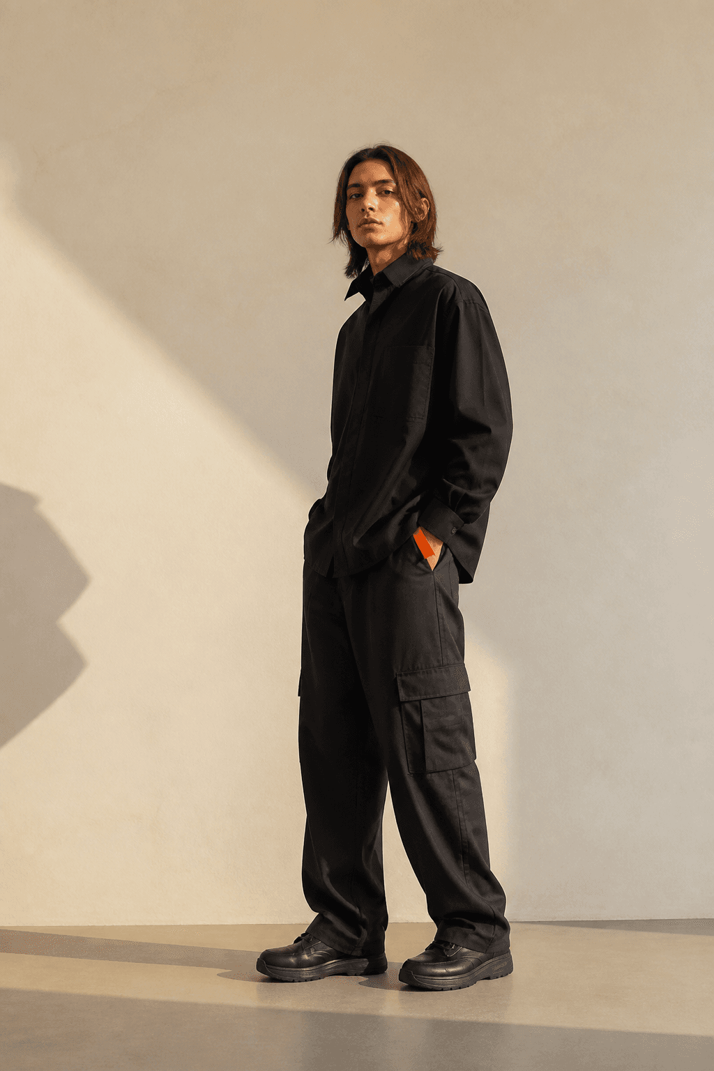
Fashion shoppers do not all arrive with the same intention. One person wants to browse a mood; another knows the kind of item they need. Wayne Manor’s concept brings campaign imagery and a product catalogue into the same experience, making it a useful starting point for thinking about both journeys.
Offer more than one way into a collection
The site presents garments, objects and accessories as category entry points, alongside editorial looks and a complete collection. Each route answers a different question. Categories help someone narrow the range. A campaign suggests combinations and context. The full catalogue lets a visitor compare without following the story in a prescribed order.
When designing similar stores, give those routes distinct labels and destinations. Avoid making an inspirational section the only way to reach products. The visitor who is ready to act should not have to decode a narrative before finding the item they came for.
Turn interest into useful information
A product card is a bridge between an image and a decision. It needs enough information to help someone decide whether to investigate, while leaving the detailed explanation to the product page. Names, category, material context and visible actions are more useful than a series of indistinguishable images.
The deeper page should answer practical questions in an order that matches the purchase. What is the item? Which version is selected? What does it cost? What should someone know about fit, care or compatibility? The answers differ by category, so a single generic description template is rarely enough for a mixed collection.
Keep familiar actions familiar
Search, wishlist and bag controls appear in Wayne Manor’s navigation. Their role is to support the experience without competing with the campaign. Expressive art direction works better when these utilities remain recognizable. A visitor should not have to learn a new visual language just to save an item or return to a selection.
For production, review these controls as states rather than isolated icons. A wishlist needs clear saved and unsaved states. A bag needs quantity and removal feedback. Search needs useful empty results. These are design and testing priorities; this portfolio study does not establish that payments, fulfilment or account persistence are connected.
Measure the transitions that matter
A useful evaluation would follow the journey from campaign to category, from category to detail, and from detail to a considered selection. Look for the point where interest stalls. A visually compelling opening cannot compensate for unclear sizing or a confusing product choice later in the journey.
Wayne Manor’s contribution to the portfolio is the connection it proposes between a fashion story and a structured storefront. The lesson is to preserve that connection throughout the experience: let imagery invite exploration, let information support comparison, and let familiar controls help visitors continue at their own pace.
Primary sources
First-party documentation and announcements used to ground this field note.