Designing Across Languages: Lessons from Hanami
How a shared visual hierarchy can support Japanese and English without forcing both languages into the same typographic constraints.

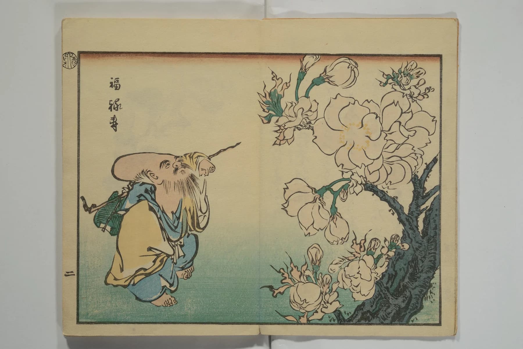
Hanami offers Japanese and English reading modes within one editorial experience. That makes it a useful starting point for a broader design question: how do you preserve the character of a site when its language changes? The answer is not to make every line occupy exactly the same space. It is to preserve orientation, emphasis and access to the story.
Share hierarchy, not identical line breaks
A bilingual interface needs a consistent understanding of what matters. The title should still be the title; captions should still read as supporting context; navigation should remain easy to recognize. But character shapes, word lengths and line-breaking rules can change the visual weight of all three. A layout that works for a short English heading may feel very different when a second script takes its place.
Design the role of each text style before fixing its dimensions. Use a flexible text container, leave room for expansion and review the actual content in both languages. Placeholder text cannot reveal the points where a heading becomes awkward or a caption gets mistaken for body copy.
Keep language choice easy to recover
Hanami places language controls at the top and again near the end of the page. This is a useful pattern for a long read: the reader does not have to return to the beginning to switch. The broader principle is that language selection should remain a utility, not a puzzle hidden inside decorative navigation.
A production checklist should include a clearly communicated selected state, meaningful accessible names and keyboard operation. Switching languages should also retain the reader’s place wherever practical. These are recommendations for bilingual projects, not claims that every behavior has been verified in this concept.
Art direction needs editorial responsibility
When a visual identity draws on another language or culture, typography alone is not enough. Artwork needs attribution, translations need review and cultural statements deserve reliable sources. A design article can describe the interface without presenting the site’s historical passages as independently verified research. Keeping those roles clear strengthens both the experience and the case study around it.
Test the experience at its tightest points
The most revealing review is often a narrow screen with the longer language selected. Check navigation, captions, heading wraps and the final links. Then try larger text and reduced motion. A page that retains its hierarchy under those conditions has a more durable foundation than one that only works in the ideal desktop screenshot.
Hanami’s lesson for our portfolio is that atmosphere and usability should be developed together. A shared visual system can hold two distinct reading experiences, provided the design gives each language enough space to be itself. The goal is continuity for the reader, rather than visual uniformity at any cost.
Primary sources
First-party documentation and announcements used to ground this field note.