Hanami
A quiet digital encounter with blossom, language and the passing of a season.
A useful product needs a clear operating idea.
How can a long-form cultural story feel immersive without making it difficult to read? Hanami explores the tension between atmosphere and clarity: a site should invite someone to slow down while keeping the words and navigation within reach.
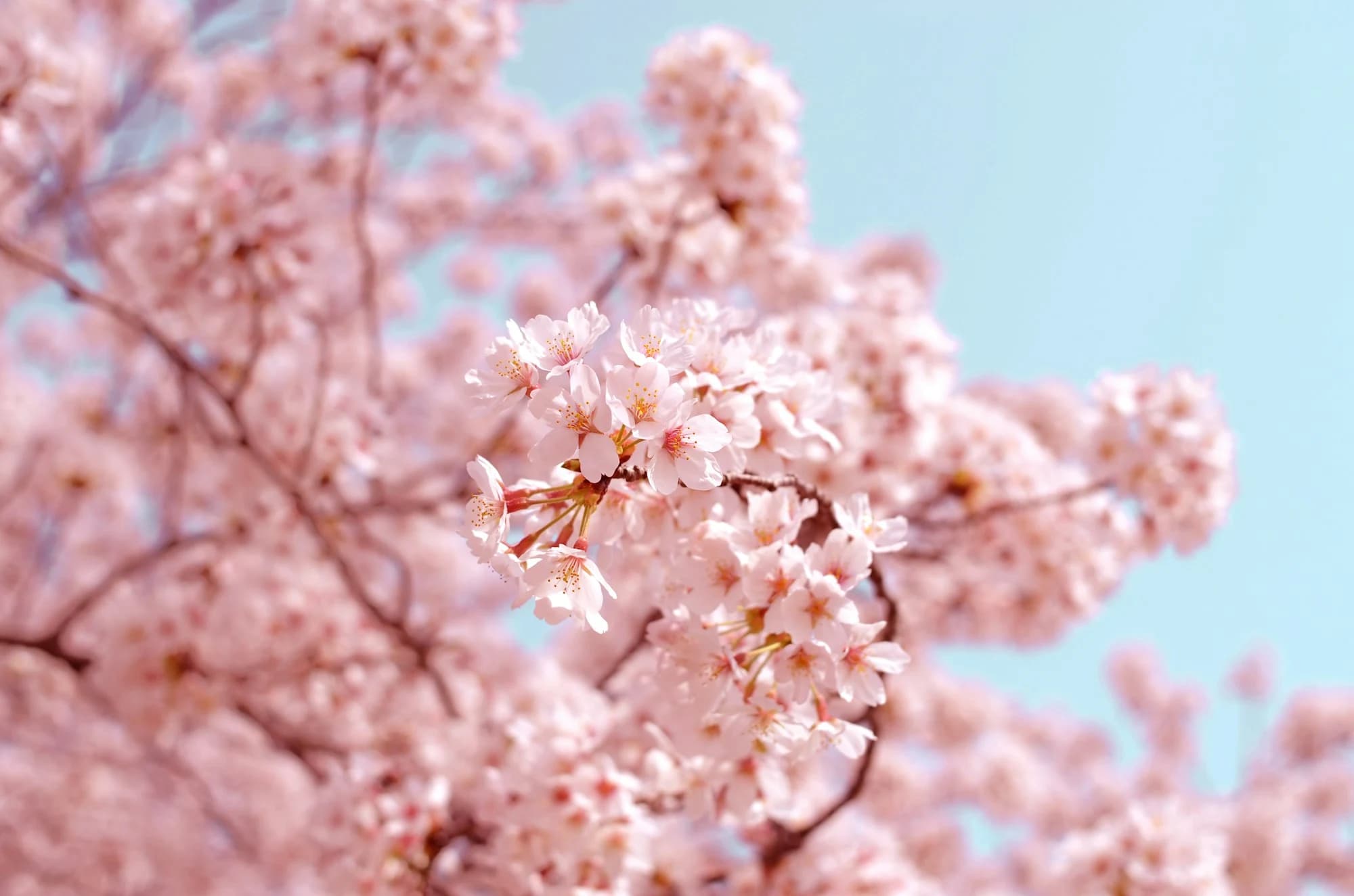
The experience pairs a blossom-led opening with a sequence of short editorial chapters. Japanese and English language controls, expressive typography, drifting petals and credited artwork establish a distinct visual identity. Presented under the OG identity, Hanami is an editorial concept study in atmosphere, language and reading rhythm.
Atmosphere with a purpose
Blossom imagery and petal motion introduce the central theme before the reader reaches the longer passages. The visual treatment becomes part of the narrative rather than a separate promotional layer.
Two languages, one experience
English and Japanese controls let readers choose how to approach the story. A shared hierarchy connects both versions while allowing their typography and text density to differ.
A connected editorial journey
Short sections, artwork captions and related seasonal destinations give the page natural pauses and a clear route onward. The result is a design study in pacing and discovery.